

this case study is undergoing development
〰️
this case study is undergoing development 〰️
My Role: UX Researcher, Copywriter, Presenter
Team: Myself and 2 other Brainstation students
Duration: 2 weeks
The Beginning:
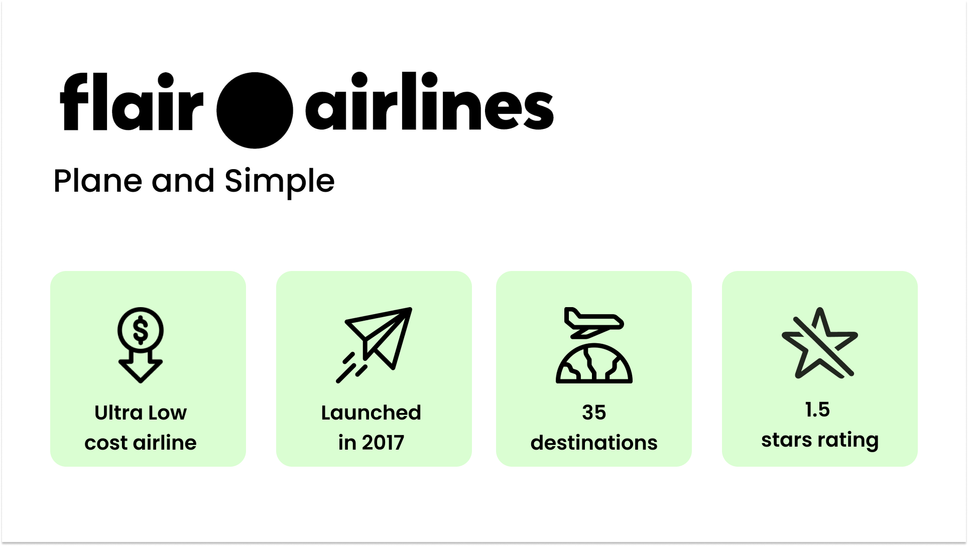
In partnership with two other individuals, my team and I set out to perform a heuristic evaluation on a company of our choice. We had the option to evaluate either the company's website or mobile products, and after considering the increased popularity of Flair Airlines in the airline industry, we decided to focus on their mobile application, which has potential for improved ratings.
We saw this as an opportunity to apply our learnings in heuristic evaluations and provide unique value to the company as a differentiated competitor in today’s market.
Step 1:
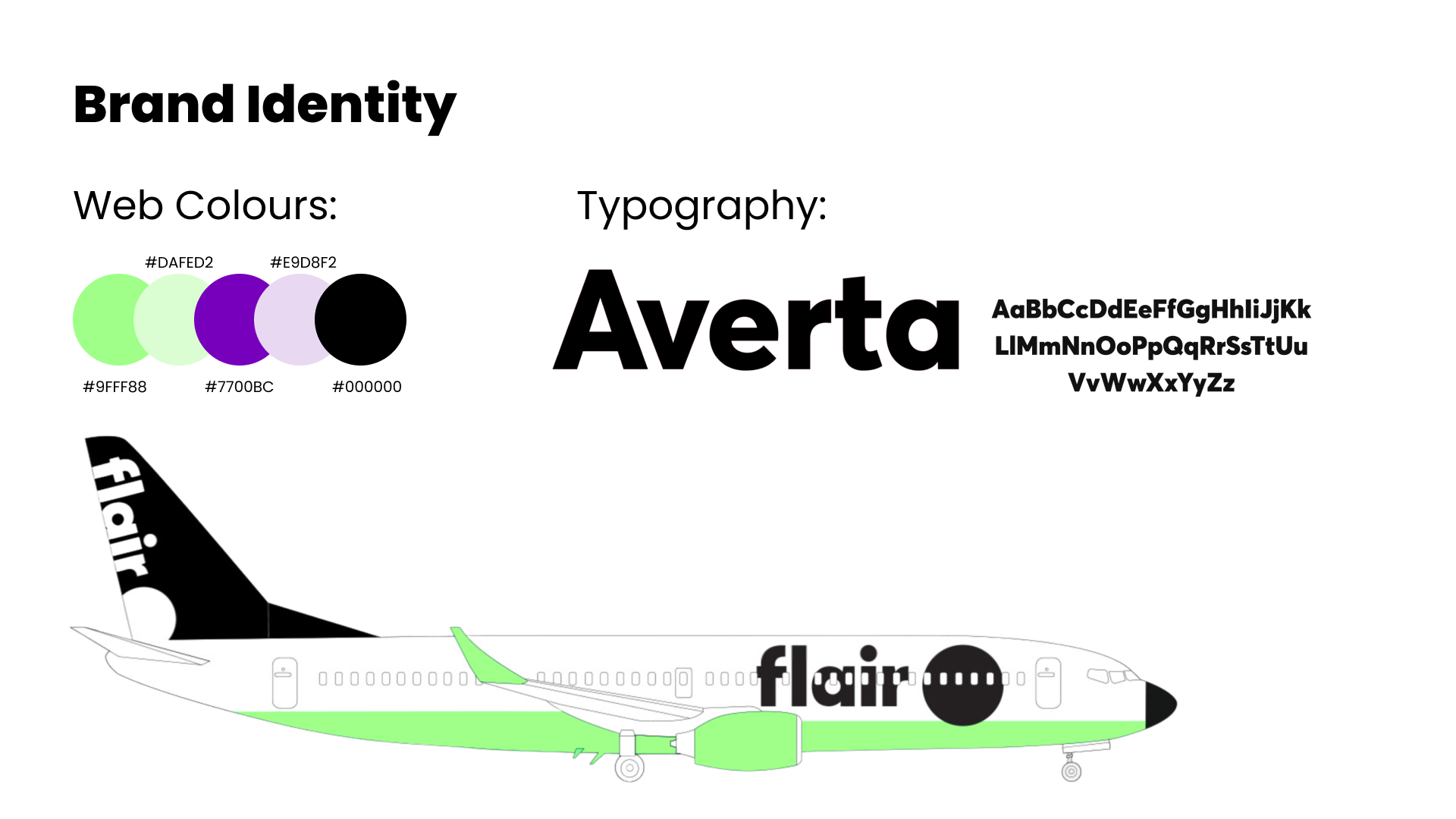
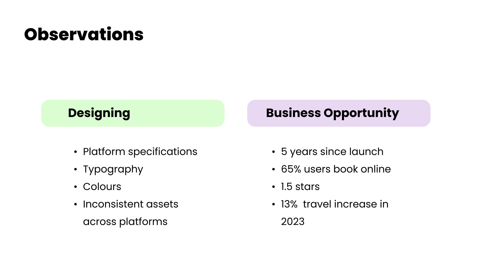
To get started, our team took a look at the brand identity and created an internal library of assets to support our design decisions and executions.
Step 2:
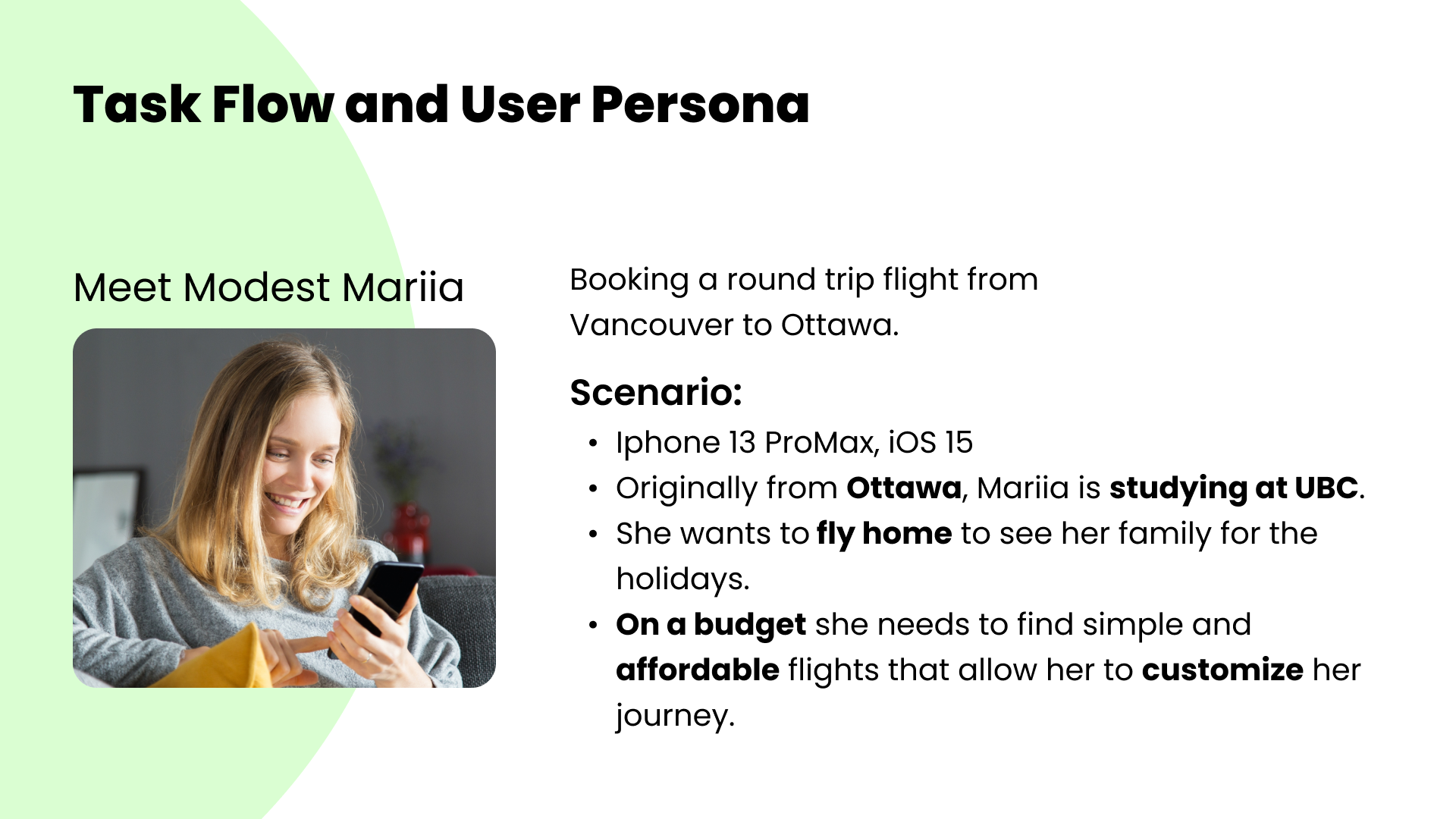
From establishing a brand library, we performed user research to determine who our possible target demographic is. Using our assumptions that a demographic of students would most gravitate to a budget and local airline, we created our proto-persona, Mariia.
Step 3:
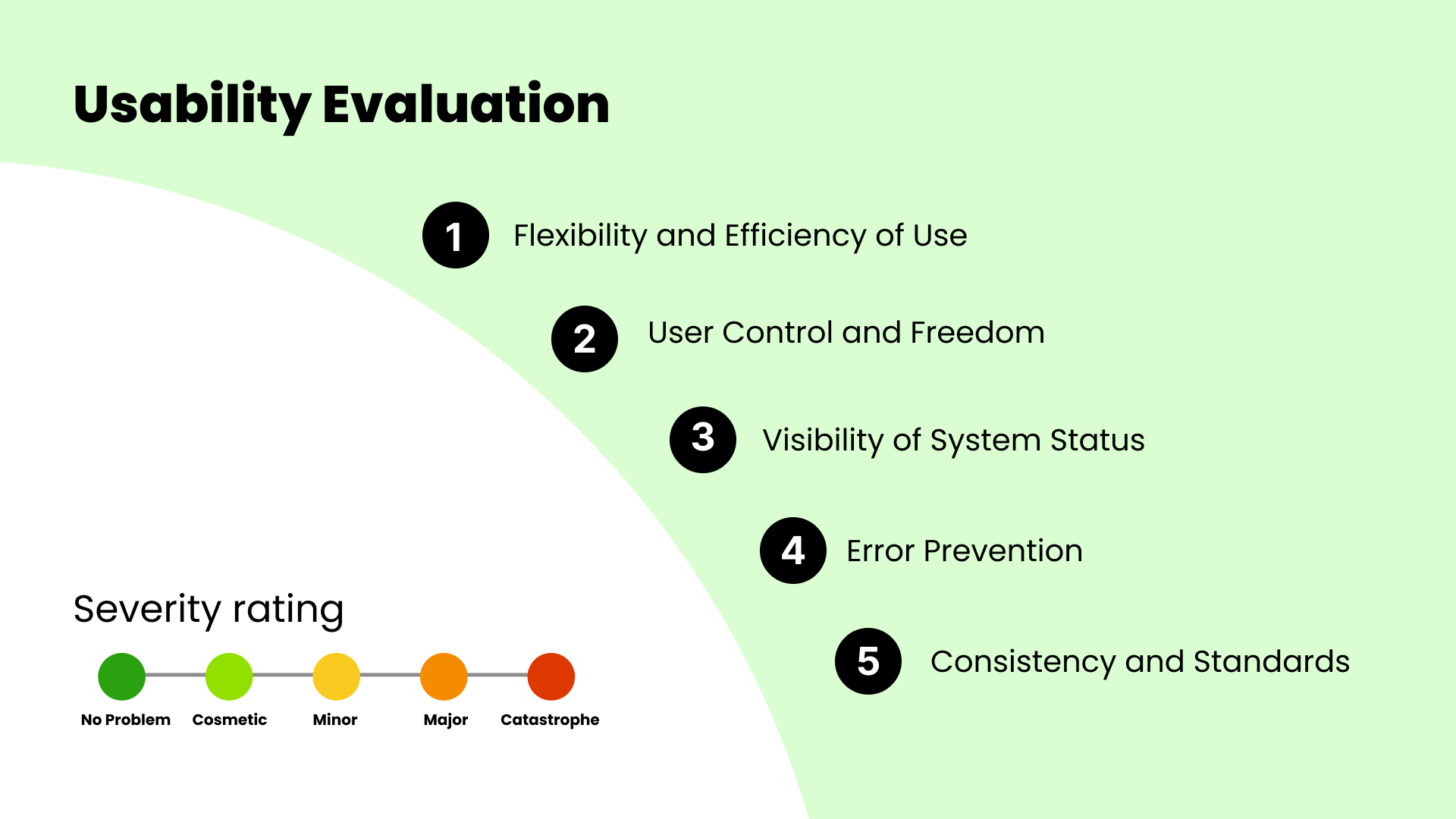
As a group we gathered for a series of 10 days for sessions lasting 1-4 hours to discuss the usability heuristics and brainstorm possible solutions. After much discussion, we collectively decided a hierarchy to which heuristics were in greatest violation within the Flair app.
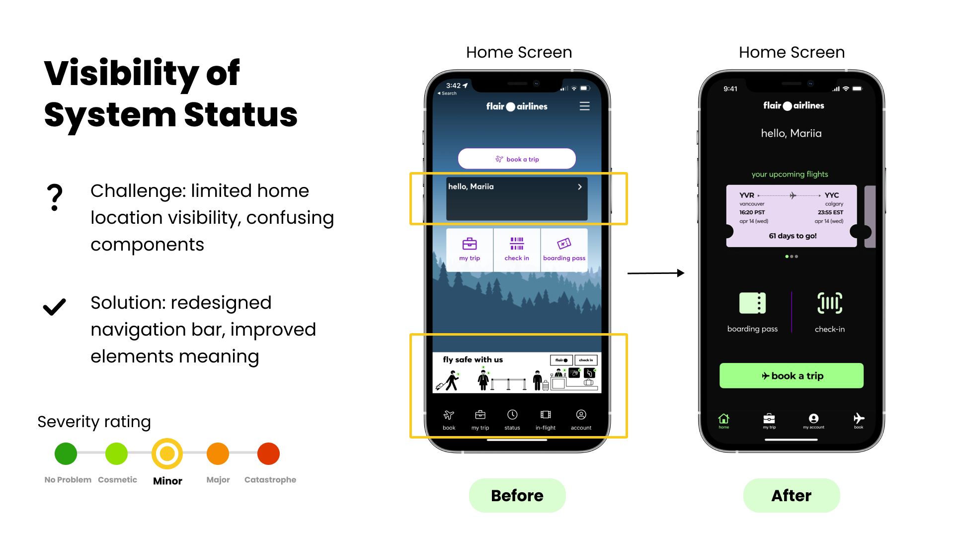
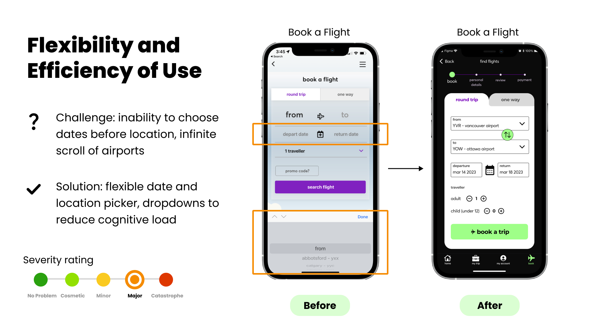
Heuristic #1
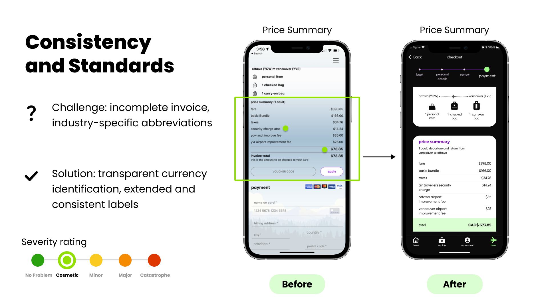
During our heuristic analysis of the app, we identified the date and location selection screen as a significant violation of the principle of flexibility and efficiency of use. The limited options and lack of review and adjustment capabilities made the process frustrating for users. To address this, we isolated the step and gave it special attention during the redesign.
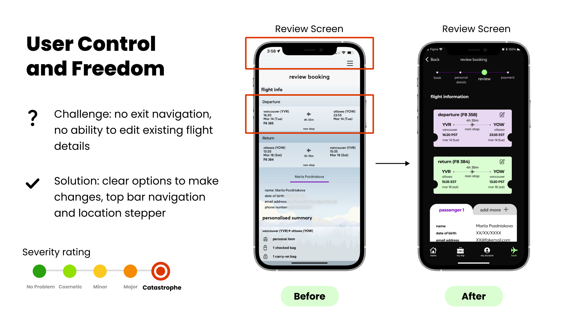
Our approach involved creating a more intuitive interface that provided users with greater control and visual feedback. We redesigned the selection process to allow users to make and adjust their selections easily, view a full-screen preview of their chosen airports, and receive clear instructions. Additionally, we allowed users to easily return to the date and location selection screen to make changes, and on the same screen allow users to select a one way or two way flight. The design changes made allow users to cut down on their confusion, and time lost on starting the selection process from the beginning. I’ll discuss this more in the following heuristic, user control and freedom.
Designed For: iOS Mobile
Goal: Heuristic Redesign for Flair Mobile Application
Lorem ipsum dolor sit amet, consectetur adipiscing elit, sed do eiusmod tempor incididunt ut labore et dolore magna aliqua. At imperdiet dui accumsan sit amet. Rhoncus aenean vel elit scelerisque mauris pellentesque pulvinar pellentesque habitant. Convallis convallis tellus id interdum.

Friends, Family, Fish.
